

There have been many Cradle-8 UI updates, e.g.:
These are explained below.
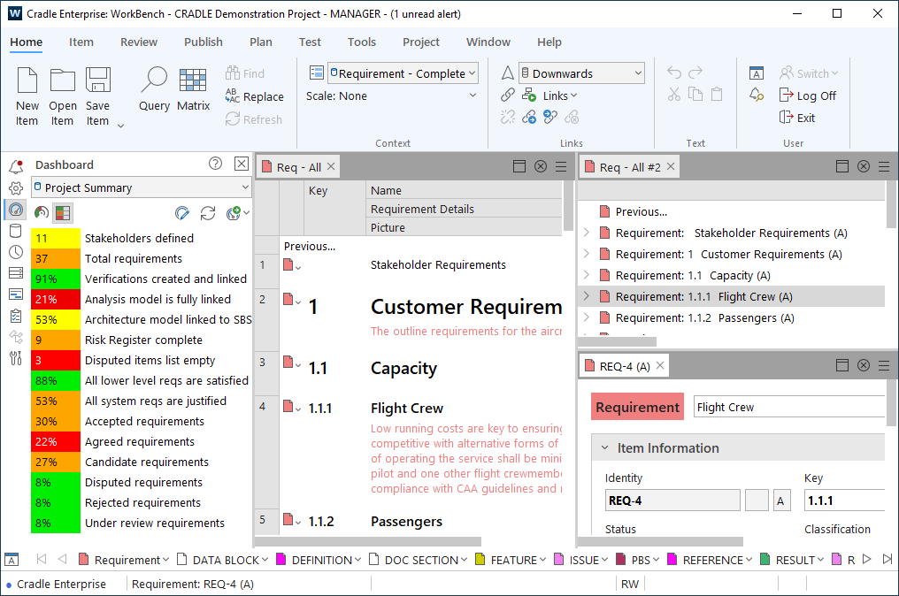
The Cradle-8 user interface has a new modern/updated look. An example of WorkBench is shown below:
Themes
You can now choose a theme (colour scheme) for the WorkBench interface. There are four themes shipped with Cradle:
- Dark
- Light (shown in the example above)
- High Contrast Dark – Similar to the Dark theme but with additional contrast in various ways
- High Contrast Light – Similar to the Light theme but with additional contrast in various ways
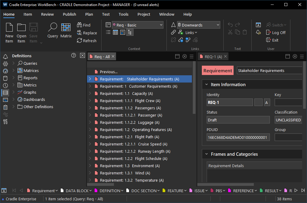
An example of the Dark theme is shown below:
An example of the High Contrast Light theme is shown below:

An example of the High Contrast Dark theme is shown below:

The theme is set in User Preferences. You also have the option to set the text and icon sizes (this is explained in the following section):

Please note if any of these options are changed you will need to restart the tool for the change to take affect.
The Web Access interface has also been updated. An example of Web Access is shown below:
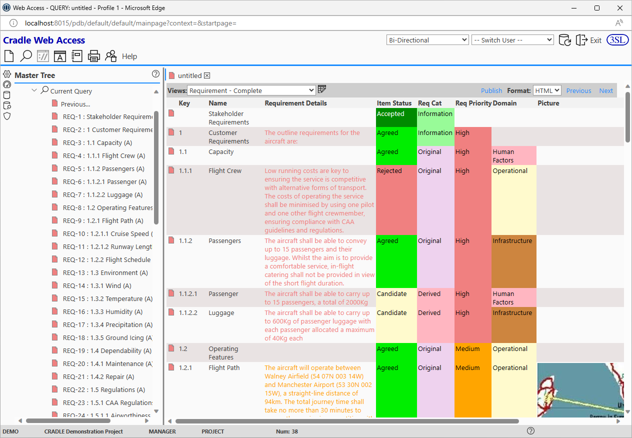
An example of the Web Access main screen using the Dark theme is:

There are only two themes available for Web Access (Dark or Light). This is set in the cws_config file.
The theme used for the following tools is taken from the Windows default:
- Message Catalogue Manager
- Project Manager
- All Toolsuite applications
Text and Icon Size
You can now choose a size for your UI text and icons in User Preferences.
The text size options are:
- Smallest – 8pt
- Small – 9pt
- Normal – 10pt
- Large – 11pt
- Larger – 12pt
- Largest – 14pt
The icon size options are:
- Default
- 1.x
- 1.5x
- 2x
Form Styling
For rows, columns and data properties you can now choose a Label Style as one of:
- Small – 9pt Segoe UI
- Normal – 10pt Segoe UI
- Heading 5 – 13px Segoe UI semibold
- Heading 4 – 11pt Segoe UI semibold
- Heading 3 – 12pt Segoe UI semibold
- Heading 2 – 15pt Segoe UI semibold
- Heading 1 – 18pt Segoe UI semibold
You can also choose a style of bold  , italic
 or underline
 .
Please note these are fixed styles and cannot be changed.
When you set any of these styling options, you can see a preview of this in the Form Details dialog:

For data properties you can also choose a Value Style as one of:
- Small – 9pt Segoe UI
- Normal – 10pt Segoe UI
- Heading 5 – 13px Segoe UI semibold
- Heading 4 – 11pt Segoe UI semibold
- Heading 3 – 12pt Segoe UI semibold
- Heading 2 – 15pt Segoe UI semibold
- Heading 1 – 18pt Segoe UI semibold
Again, you can also choose a style of bold , italic or underline . This controls the display of the data value.
These are also fixed styles and cannot be changed by the user.
From the Form Details dialog you can also set a background colour either for the whole form or for individual rows/columns. The example below shows a form with a background colour set:

The Background option in the Form Details dialog is shown below:

If a background has been set, you can see this at a glance in the Form Details dialog:

Phase Styling
You can now control the appearance of text in the phase hierarchy nodes as shown below:

The options are:
- Text Style – Choose the style of the text as one of:
- Small – 9pt Segoe UI
- Normal – 10pt Segoe UI
- Heading 5 – 13px Segoe UI semibold
- Heading 4 – 11pt Segoe UI semibold
- Heading 3 – 12pt Segoe UI semibold
- Heading 2 – 15pt Segoe UI semibold
- Heading 1 – 18pt Segoe UI semibold
 – Make the text bold
- – Make the text italic
- – Underline the text
- Foreground – Set a foreground colour
- Background – Set a background colour
Any changes made to the appearance can be seen in the following places:
- Phase tree within the Phases section of Project Setup
- Phase sidebar in WorkBench
- Phase sidebar in Web Access
Heading styles are automatically bold so you cannot change the bold setting for these.
An example is shown below:

Text Frame Colour Usage
A new user preference has been added which determines how a text frame displays the colour from it’s associated category (if any). The options are:
- None – Do not display the colour
- Foreground – The text will be coloured
- Background – The text area will be coloured and the text will be black or white
- Bar – A coloured bar is shown alongside the text area (this is the default)
An example text frame using the Foreground user preference is:

The same text frame using the Background user preference is:

The same text frame using the Bar user preference is:

Web Publisher
New icons have been added to Web Publisher and the fonts have also been updated in the Web Publisher templates:

Please note some Web Publisher themes have also been removed.