Marking Category Values as Obsolete

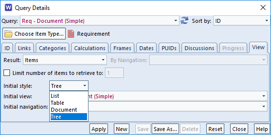
When setting up a single value pick list or multiple category, you can define any number of possible values. These can be chosen by a user as the value of the category in an item.

However, over time, category values may no longer be relevant.

Removing the values from the project schema would be the wrong course of action as values could still exist in items (possibly in old baselines) that would raise errors in item integrity checks and could cause problems when data is imported. For example, data that used to be valid can no longer be imported unless extra import options are selected to ignore the validation of data.

Set Category Values as Obsolete

Instead of deleting those values from the project schema, you can set category values as obsolete so that the value can no longer be entered by users but the historical values remain valid.

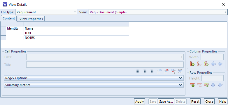
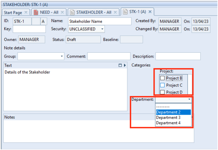
In this example, Project A might have been completed so is no longer valid to set for future items. Also, Department 1 might not be responsible for any future items but they were responsible for historical ones.

Obsolete category value option
Marking a multiple value category value as obsolete
Obsolete category value option
Marking a single value category value as obsolete

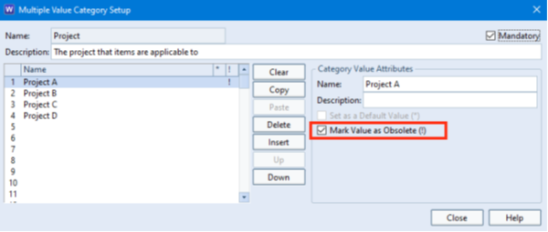
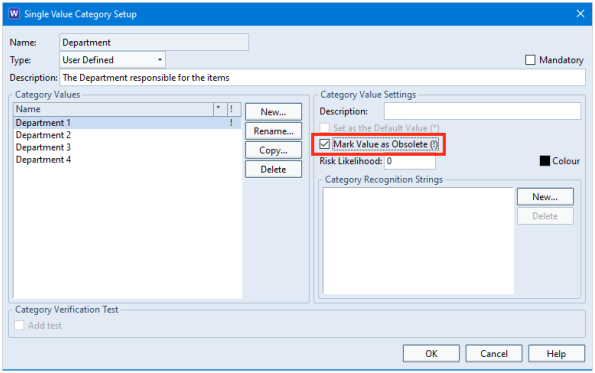
Once set, any items that had been set to the obsolete value remain valid. However, users can only enter the values that are currently valid; not the ones that are marked as obsolete.

Categories in a form
Items only allow valid values to be set

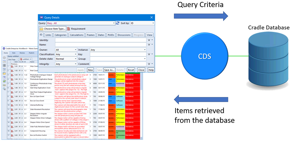
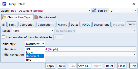
When querying the database, you can still set the query criteria to search for items that are marked as obsolete.

Querying for obsolete category values
Querying the database on category values marked as obsolete

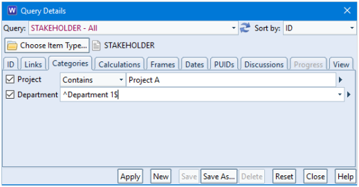
Any validation checks on items in the database will return without error because the value remains defined in the schema.

Next and Previous

When a query is run in WorkBench, the tool will return a list of the items matching the criteria specified.

As a Cradle database can contain any number of items of information a query could find 0 to 1 million items.

Items in Cradle Database

The time taken to find so many items could be excessive. Therefore, queries find and return items from the database in blocks. The default size of a block is 1000 items but can be extended to 8000 items in UI Control user preferences:

User Pref Options
Retrieve Item Options in User Prefs

This means that when you run a query it will return at most N items.

Navigating between Blocks of Data

When the block is shown in the WorkBench UI, it is preceded by Previous… and followed by Next….

If you select these, then the query is re-run to find the next block or the previous block of items.

Query showing Previous option
Query showing Next option

In this example, clicking the Next… option will retrieve the next set of items in the query:

Query showing items
Query showing items

Selecting Previous… again will return you to the previous block of items.

Reporting Items

If you are creating a report or publishing a document using a query, it is likely that you would NOT wish to be restricted by blocks of items.

Reports allow you to specify:

  • Selected items – items highlighted in the query
  • All items in this set – the block of N items
  • All matching items in database – the totality of items matching the query criteria

    Publish Table Dialog
    Publish Table options


Simplifying your WorkBench Environment

WorkBench is an extremely flexible and customisable tool which can then result in user complexity as it provides such a wide range of displays and outputs for your project data:

  • MANY definition files to show queries and views of how you want to see your data
  • MANY types of reports and documents tailored for your required outputs
  • Different outputs/views of the project required at particular stages

With so many features available to users, it is important to understand how we can manage to reduce the complexity of the tool for them by using the Phase Hierarchy and/or Start Pages:

WorkBench Environment
Simplifying your WorkBench environment

We can reduce tool complexity by the use of the Phase Hierarchy and/or Start Pages.

Phase Hierarchy

The phase hierarchy is an order of elements that can be grouped together under different folders to describe the process or project lifecycle of your project. You can think of these as phases, activities or tasks.

Creating a phase hierarchy is the task of a Project Administrator who needs PROJECT privilege and is created in Project Setup.

Each element of a phase can run an operation in an organised structure which is shown by expanding folders such as:

  • Running saved queries
  • Opening an item/set of items
  • Expanding a tree
  • Running a matrix
  • Running a metric
  • Producing a report
  • Producing a graph
  • Producing a draft document (Document Publisher)
  • Executing an external command
Phase Hierarchy
Defined Phase Hierarchy

These phase operations are for all users of the project. However, you can restrict operations to a particular team or a particular skill:

Phase hierarchy showing skill

The phase hierarchy is also used in the Web Access tool.

Please note that the phase hierarchy feature is not available in single-user products.

Start Pages

Whereas a phase hierarchy defines the whole process and the activities to be performed, start pages could help to automate the steps to perform each activity for a particular user or set of users.

Start pages also allow you to open a specific WorkBench dialog or run a tool such as Document Loader that will simplify usage considerably as your users would have all relevant operations in an organised page without having to navigate through all of the menus, ribbons and dialogs.

These are organised in:

  • Labels
  • Headings
  • Actions / multiple actions

You can also add images to your start page which can be very useful in customising the interface for your project:

Start page
Example Start Page

Start pages can also allow you to run multiple operations with a single click.

You can define multiple start pages for a specific set of tasks and for multiple sets of users.

Start Page Details option

Summary

The phase hierarchy and start pages allow you to simplify the user experience of WorkBench.

The phase hierarchy defines a set of operations in folders which can be filtered for specific sets of users. This feature is not available in single-user products.

Start pages can be more personal and will quickly allow you to complete a task or create an output without having to navigate the WorkBench menu, ribbons and dialogs and saved definition files.


Showing Filtered “Transitive” Links in Tables

Problem

We have created some links between Cradle items but we only want to see a filtered set of these links in our table.

Rationale

Cradle has a unique ability to follow cross references transitively. This means that although an item might not be directly cross referenced from it’s source, it might be linked indirectly through another item/item type.

Cradle also has the ability to name cross references referred to as link types and even group sets of link types together referred to as link groups.

Combining these features can allow flexibility for the output of items that have some relationship to the source which will reduce the number of direct cross references required.

For example, we would like to show dependencies between item type A and item type C but ONLY those that have a yellow and blue link type.

Model showing defined Links Between Item Types
Defined Links Between Item Types

We can see in the screenshot below that only A-6 and A-11 are transitively linked to items of item type C with both a blue and a yellow link:

Showing Direct Links in a Nested Table
Direct Links in a Nested Table

Setting Link Groups

We can define a link group in Project Setup in which we can select from the available link types.

Screenshot showing how to define a link group
Defining Link Groups

This defined link group can be used in navigations.

Defining Navigations

Navigations allow us to specify how we would like to follow the links that have been created between items. This is a very powerful feature as we can also specify that we would like to follow links transitively:

Defining a Navigation to follow Cross References transitively in the Navigation Details Window
Defining Navigations to Follow Cross References Transitively

Using the Navigation in Views

We can now use the navigation to specify that we want to show links between item type A and item type C that are followed transitively but we ONLY want to show the group of links YELLOW AND BLUE. Remember that there are NO DIRECT links between these two item types. The cross references are from item type A to item type B and also from item type B to item type C:

Defining a View to allow links to be shown transitively between item
Using the Transitive Navigation in Views

Applying this view, we can see that only the YELLOW AND BLUE links are shown in the table. The remainder appear blank:

Output of a table that shows links that are transitive when they exist
View Showing Transitive Cross References

Using the Navigation in Queries

We might wish to only show items in our table that have these links in preference to showing all items and just appearing blank where the transitive link does not exist. We can achieve this in the Query Details dialog:

Using the Query Details Window to filter items that do not have any indirect transitive links
Filtering Items Non-Linked Items in a Query

This will now filter out of the list any items that do not match the navigation criteria:

Screenshot showing the resulting table that only shows items where a transitive link exists
Link Table Only Showing Items Where Transitive Link Exists

Showing Path in a Tree Style

If we followed the path in a tree style showing downward links, we can see that item type A (A-6 and A-11) are not directly linked to item type C (C-1). They go through item type B (B-2):

Screenshot showing the direct links between items in a tree style to prove that the items are not directy linked
Links shown in Tree Style

Summary

Cradle provides a unique ability to allow cross references to be followed transitively (through other items).

Transitive navigations can be applied to views and queries. This provides a very powerful filtering mechanism that allows us to show non-direct dependencies between items.

Testing Cradle on additional platforms

With the release of 7.7 coming very soon, we thought we’d test Cradle on additional platforms.

So here’s Cradle 7.7 running on a Steamdeck, in Desktop mode.
Cradle running on Steamdeck

Cradle About screen running on Steamdeck

As SteamOS is based on Arch Linux, our 64 bit Linux version can be installed.

Both the CDS and WorkBench are running on this very capable device. A keyboard and mouse may work better than the on screen keyboard.

If you install the service manager (systemd script) then the Cradle Database Server (CDS) will start on boot up of the Steamdeck, so you might not want to do that if its primarily used for Steam. However, once started the CDS will stay running in the background when you switch to Gaming Mode. If you have others connecting to your CDS then they can continue to work while you improve your hand-eye coordination in your favourite game.

Although Steamdeck is not an officially supported platform, you can see Cradle does indeed run on additional platforms

Batch File Startups & Shortcuts

There are a number of options that you can use when starting tools. WorkBench for example can be started connecting to a specific CDS. Sometimes, specific environment variables must be set. This is where using a Windows batch file startup is useful.

Windows Batch Files

A batch file is a short script, a list of commands that are run as if you had executed them from the command line. It could be that you want to connect to a company driver, run WorkBench and then exit. You may want to run a specific query on a specific project with the UI in a particular language.

batch file content
Command Batch Files

Examples

Run WorkBench in English connecting to a particular server.

@rem starting Cradle WorkBench in English on UK_3SL_07 server
set CRADLE_UI_LANG=en_gb
start "Cradle WorkBench" "%CRADLEHOME%\bin\exe\windows\work.exe" -cds UK_3SL_07

Or you can run WorkBench, with the company documents drive connected.

rem starting Cradle WorkBench with documents drive
echo Mapping network drive...
net use z: \\UK_3SL_07\company
if errorlevel 1 (
echo Unable to use shared folder \\UK_3SL_07\company
echo Quitting!
exit /b
)
"%CRADLEHOME%\bin\exe\windows\work.exe"
net use z: /delete

You can even, run WorkBench, logging in and showing a query with a French UI.

@rem starting Cradle WorkBench in French and run query
set CRADLE_UI_LANG=fr
start "Cradle WorkBench" "%CRADLEHOME%\bin\exe\windows\work.exe" -action queryrun -query "Design - linked Test" -qloc project -login NISHMA,nishma,WOSY

Once you save the batch file, you can execute it from the File Manager, or a Shortcut, or as we’ve illustrated by double clicking the icons on the desktop.

Shortcuts

Windows desktop shortcuts can be created to directly run WorkBench. You’ll be able to set all the command line options, but won’t be able to do anything like connecting a drive.

Simply drag the WorkBench icon from the WindowsStart menu‘ onto your desktop. Right click and select Properties then add any options to the command line in the Target field. This example shows how we log into the DEMO project really quickly.

running WorkBench from a shortcut
WorkBench shortcut

Command Line Options for WorkBench

If you run WorkBench from the command line with a -help option,

C:\”%CRADLEHOME%\bin\exe\windows\work.exe” -help

you’ll be shown all the values that can be entered into a command line call.

list of command line options for WorkBench
WorkBench Command Line Options
usage: work.exe [options]
options are:
   [-cds]
   [-display ]
   [-login ,,]
   [-noldap]
   [-nobanner]
   [-ro]
   [-action {itemview | queryrun}]
   for itemview:
      -pduid [-version ] [-draft ]
      [-form -floc ]
   for queryrun:
      -query -qloc
      [-view -vloc ]
   where loc is one of:
      system automatic project usertype team user personal
   [-errorstack]
   [-ver]
   [-help]

These values can be used in a direct shortcut , or in the command entered into he batch file.

Tree Style

You can find items in a Cradle database by running a query. For example, you can use the pre-defined queries in the Quick Access Bar at the bottom of the UI. Once the query has run, the results are shown in a display style. Tree style is one of the four styles available:

A view is used to specify which parts (attributes) of the items will be shown. A display style controls how these attributes will be displayed, and the facilities that are available to you.

Tree Style

This is the second most frequently-used of the display styles after table style. It displays each item as a node in a tree, with a set of columns for the other attributes:

display items using tree style in 3SL Cradle RM SE Tool
Items Shown in Tree Style

There are two views used to display trees:

  • A view that specifies the contents of the node shown in the tree. You specify this view in the schema for the item type.
  • A view that specifies the attributes shown in columns to the right of the tree

To have items displayed in this style:

  • Specify it in the query to be run:
choose tree style in a query in 3SL Cradle RM SE Tool
Specify Tree Style in a Query
  • Also, select it from the Context group in the Home tab:
choose tree style in the UI in 3SL Cradle RM SE Tool
Choose Tree Style in the UI Ribbon
  • Or, right click and choose Style -> Tree from the context-sensitive menu
  • Finally, press <CTRL> and 4

Facilities

  • Use the left mouse button to select individual items
  • You can select a groups of items by selecting the first and then pressing <SHIFT> and the left mouse button to select the end of the group
  • Press <CTRL> and the left mouse button to select or de-select individual items
  • You can shrink and widen the display columns. Move your cursor to the edge of a column heading and the cursor will become a pair of arrows. Press, drag and release the left mouse button to change the column’s width.
  • You can follow cross references by expanding the tree node for the item. Cradle will find all cross references to and from the item, select which cross references to use, and display the items at the other end of these cross references as new nodes in the tree.
  • Use drag-and-drop items between trees to create cross references between the items
  • Drag-and-drop items inside a hierarchy of the same type of items to reorder that hierarchy and automatically rebuild the hierarchical numbering within it

You can expand a tree node by:

  • Click its + button
  • Select the text of the tree node and press: +
  • Select the text of the tree node, right click, and choose Expand from the menu
  • Double click on the text of the tree node

You can collapse a tree node by:

  • Click its button
  • Double-click on the text of the tree node
  • Select the text of the tree node and press:
  • Select the text of the tree node, right click, and choose Collapse from the menu

Advantages

The advantages of tree style are that it is:

  • The simplest way to explore items and their relationships
  • A convenient method to create cross references
  • The easiest way to reorganise a hierarchy of items

If you want to do anything with cross references between items, or to work in a hierarchy of items, then this is the best display style to use.

Disadvantages

The disadvantages of tree style are that:

  • It provides a limited ability to display information
  • You cannot edit information directly

Summary

Tree style is the most convenient method to work with cross references within a set of items and between one set of items and other sets of information.

Therefore, we recommend this style whenever you need to work with cross references between items and inside hierarchies.

Document Style

You can find items in a Cradle database by running a query. For example, you can use the pre-defined queries in the Quick Access Bar at the bottom of the UI. Once the query has run, the results are shown in a display style. Document style is one of the four styles available:

A view is used to specify which parts (attributes) of the items will be shown. A display style controls how these attributes will be displayed, and the facilities that are available to you.

Document Style

This is the second most flexible of all the display styles. It displays each item as a set of one or more rows and one or more columns (as controlled by the view), with invisible borders around each of the cells. You can edit items directly in this display style.

display items using document style in 3SL Cradle RM SE Tool
Items Shown in Document Style

This display style is similar to table style, except that:

  • The height of each item’s row is set by the information to be shown. So some rows are shallow and other rows are deep. If an attribute contains no data, its height will be close to zero.
  • Different sized fonts are used to display the first row in the view. The size of the font is based on the level of the item being shown. This level is based on the number of dots (periods) in the first attribute shown in the row. This is typically the Key, or whatever attribute you may have specified to hold the item’s hierarchical number.
  • The borders around the rows and columns are invisible

For document style, you should use views that show attributes in successive rows, rather than successive columns. For example:

view to items using document style in 3SL Cradle RM SE Tool
Arrangement of Attributes in a View for Document Style

The result is that items are displayed in a style that looks like a document, with large font for section headings and smaller fonts used for subsection headings.

To have items displayed in this style:

  • Specify it in the query to be run:
choose document style in a query in 3SL Cradle RM SE Tool
Specify Document Style in a Query
  • Also, select it from the Context group in the Home tab:
choose document style in the UI in 3SL Cradle RM SE Tool
Choose Document Style in the UI Ribbon
  • Or, right click and choose Style -> Document from the context-sensitive menu
  • Finally, press CTRL and 3

Facilities

Document style provides a wide range of faciltiies.

Selecting Items

  • Use the left mouse button to select individual items
  • You can select a groups of items by selecting the first and then pressing SHIFT and the left mouse button to select the end of the group
  • Press <CTRL> and the left mouse button to select or de-select individual items

Changing the Display

  • You can shrink and widen the display columns. Move your cursor to the edge of a column heading and the cursor will become a pair of arrows. Press, drag and release the left mouse button to change the column’s width.
  • You can move any row or column in the view. Move your cursor onto any cell border and the cursor will become a pair of arrows. Press, drag and release the left mouse button to move that border.
  • By default, all rows are displayed with different heights, you can increase or decrease the height of any row
  • You can sort the data in any column. Click the column heading and choose a sort order, either ascending or descending, in either a case-sensitive or case-insensitve manner (this only applies to languages that have upper-case and lower-case characters)
  • Tooltips are displayed for each column. Move your cursor into a column heading and after a second, a description of that attribute will be shown. You can enter these descriptions in the schema.
  • You can see tooltips for some attribute values. Move your cursor into a cell that displays a category with a pick-list of possible values. A tooltip appears containing a description of that category and category value. You can enter these descriptions in the schema.

Exploring Data

  • You can expand rows to follow cross references. Double-click the heading for an item’s row and that row will expand to show one new row for each item linked to the original item. Repeat this as many times as you like.
  • You will see the level of any expanded row as the number of dots in its row heading
  • You can collapse rows by double-clicking the row heading.

Editing Data

  • You can edit items directly Click inside any cell. If you have RW access to the item, Cradle locks the item so you can edit it.

Advantages

The advantages of document style are that it is:

  • Flexible. You can adjust the display and sort information.
  • Navigable. You can explore the database by expanding rows to follow cross references.
  • Editable. You can edit information through the display style.
  • Readable. All items are shown with a display height to display their entire contents.

Disadvantages

The disadvantages of document style are that:

  • It takes much longer to display than list style or tree style
  • The rows displaying information are of different heights, so you may not see many items at the same time. You may need to scroll more than in other display styles.

Summary

Document style is the second most flexible of Cradle’s four display styles, after table style. It is not the quickest style to generate, but it does provide a familiar document-like view of information and a lot of capability.

Therefore, we recommend document style whenever you want to display items in a document format. This can be very helpful for users who are more familiar with using documents, rather than data-orientated tools.

Table Style

You can find items in a Cradle database by running a query. For example, you can use the pre-defined queries in the Quick Access Bar at the bottom of the UI. Once the query has run, the results are shown in a display style. Table style is one of the four styles available:

A view is used to specify which parts (attributes) of the items will be shown. A display style controls how these attributes will be displayed, and the facilities that are available to you.

Table Style

This is the most flexible of all the display styles. It displays each item as a set of one or more rows and one or more columns (as controlled by the view), with borders around each of the cells. You can edit items directly in this display style.

display items using table style in 3SL Cradle RM SE Tool
Items Shown in Table Style

To have items displayed in this style:

  • Specify it in the query to be run:
choose table style in a query in 3SL Cradle RM SE Tool
Specify Table Style in a Query
  • Also, select it from the Context group in the Home tab:
choose table style in the UI in 3SL Cradle RM SE Tool
Choose Table Style in the UI Ribbon
  • Or, right click and choose Style -> Table from the context-sensitive menu
  • Finally, press <CTRL> and 2

Facilities

Table style provides a wide range of facilities.

Selecting Items

  • Use the left mouse button to select individual items
  • You can select a groups of items by selecting the first and then pressing SHIFT and the left mouse button to select the end of the group
  • Press <CTRL> and the left mouse button to select or de-select individual items

Changing the Display

  • You can shrink and widen the display columns. Move your cursor to the edge of a column heading and the cursor will become a pair of arrows. Press, drag and release the left mouse button to change the column’s width.
  • You can move any row or column in the view. Move your cursor onto any cell border and the cursor will become a pair of arrows. Press, drag and release the left mouse button to move that border.
  • By default, all rows are displayed the same height, but you can increase the height of any row
  • You can sort the data in any column. Click the column heading and choose a sort order, either ascending or descending, in either a case-sensitive or case-insensitve manner (this only applies to languages that have upper-case and lower-case characters)
  • Tooltips are displayed for each column. Move your cursor into a column heading and after a second, a description of that attribute will be shown. You can enter these descriptions in the schema.
  • You can see tooltips for some attribute values. Move your cursor into a cell that displays a category with a pick-list of possible values. A tooltip appears containing a description of that category and category value. You can enter these descriptions in the schema.

Exploring Data

  • You can expand rows to follow cross references. Double-click the heading for an item’s row and that row will expand to show one new row for each item linked to the original item. Repeat this as many times as you like.
  • You will see the level of any expanded row as the number of dots in its row heading
  • You can collapse rows by double-clicking the row heading.

Editing Data

  • You can edit items in a table. Click inside any cell in the table. If you have RW access to the item, Cradle locks the item so you can edit it.

Advantages

The advantages of table style are that it is:

  • Flexible. You can adjust the display and sort information.
  • Navigable. You can explore the database by expanding rows to follow cross references.
  • Editable. You can edit information through the display style.
  • Compact. All items are shown with the same display height.

Disadvantages

The disadvantages of table style are that:

  • It takes longer to display than list style or tree style
  • The rows displaying information are all the same height, so you may have to click in a cell or expand a row border to see all of the information in some attributes

Summary

Table style is the most flexible of Cradle’s four display styles. It is not the quickest to generate, but it provides the most capability.

Therefore, we recommend table style as the best general purpose display style in Cradle. Unless you need something provided by a different display style, use table style.

Using Sessions in the Cradle UI

The Cradle UI displays information inside tabs. These tabs are grouped into panes. You can design your Cradle UI with a set of panes grouped in nested rows and columns in your preferred layout. This layout is called a session. Using sessions is the easiest way to maximise your productivity with Cradle.

You can save your current layout of panes, and the tabs inside them, in a session. You can then restore this session when you login to Cradle. When you do this, Cradle will restore the panes, organise them in your preferred layout, and where possible, automatically recreate all of the tabs inside each pane by re-running queries and so on.

The result is that when you login to Cradle and specify a session, your Cradle UI will look the same as it did when you last logged-out.

This will save you a lot of time and help you to complete your work more quickly and effectively!

Working With Sessions

Using sessions is very easy:

  • You can save a session at any time
  • You can specify a session when you login.

Saving a Session

You can save your current WorkBench layout as a session by clicking Save As in the Session group in the Window tab in the UI’s ribbon:

Using Sessions in 3SL Cradle WorkBench
Save a Session

You will be asked to enter a name for the session. When you are working in WorkBench with a session, you can update the saved session to match your current layout of panes and tabs by clicking Save,

Using Sessions

When you next login to Cradle WorkBench, you can choose your session from the drop-down list in the Login dialog:

Using Sessions in 3SL Cradle WorkBench
Specify a Session at Login

and your layout of panes and tabs in the session will be restored, re-running queries and so on as necessary.

You can also reload the session that you chose at login by selecting Reload. from the Session group in the Window tab in the UI’s ribbon.