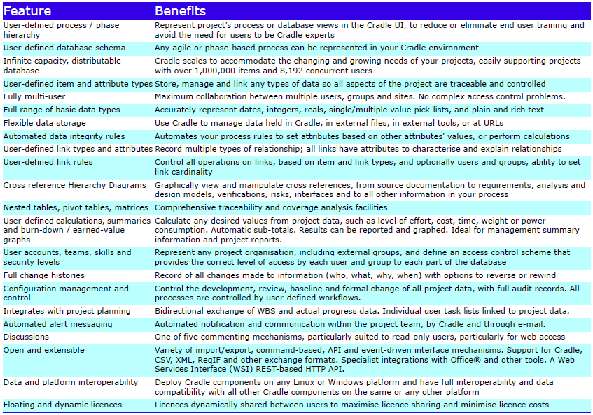
The Cradle PDM module provides the infrastructure for all other Cradle modules. Its scalability and flexibility create an industrial strength, proven, shared data environment for even the largest projects:
Databases
Cradle supports any number of databases, each with its own schema, CM system and users. Each database supports many projects. Use the Project Manager tool to organise this environment by user-defined criteria, for example as hierarchies.
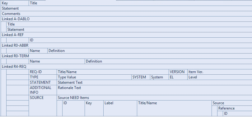
Each database stores any number of items, of any number of types (requirements, risks, classes, user stories, functions) defined by a UI. Items have any number of attributes, each of a user-defined type, that manage up to 1 TByte of any type of data, held in Cradle, or referenced in external files, URLs or another tool or environment.
Calculations
User-defined calculations are supported in all parts of Cradle and can be displayed as graphs, in views and user-defined reports. User-defined rules can be applied to automatically set attribute values or perform calculations, to maintain the integrity within and between items.
Cross References
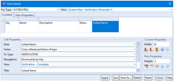
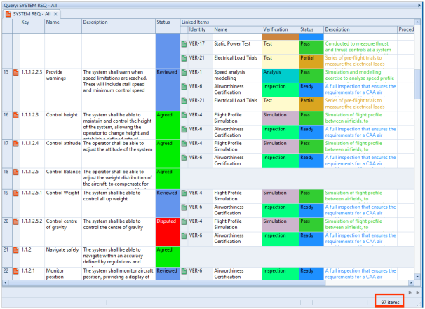
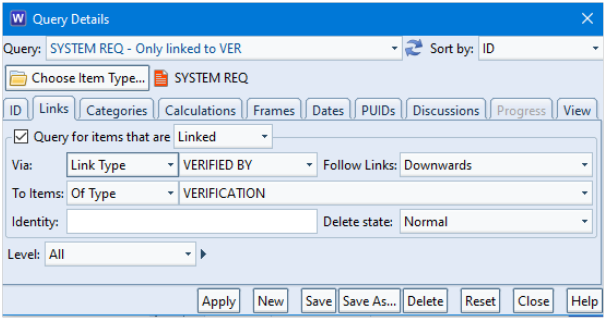
Items can be cross referenced, with optional user-defined link types and groups. Links have user-defined attributes to justify, parametrise, explain or characterise them. You control which links are used to navigate or report traceability, based on link type or group, direction and link attribute values. Links are both direct and indirect, for full lifecycle traceability, impact and coverage analyses.
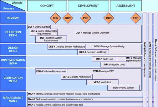
Process Tailored Environment
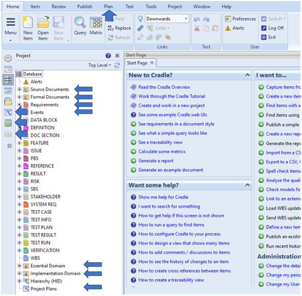
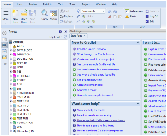
You use start pages and a phase hierarchy to build an environment tailored to your process. End users only need to be trained in your interface, reducing training time and costs:
- Start pages are text and graphics controls that perform your choice of operations simply and easily
- The phase hierarchy shows the process as a hierarchy in which an agile or phase activity, task, sprint, report or document is run by a mouse click. Different parts of the phase hierarchy can be shown to each user or stakeholder group.
Traceability and coverage views are available as trees, nested and pivot tables, matrices and Hierarchy Diagrams. Unique transitive links give traceability across the full system lifecycle.
Configuration Management
Items evolve through versions that are managed in baselines and controlled by a built-in CM system, with mechanisms for review, baseline and version control, full change control, and audit trails.
Cradle can track all changes. Edits can be reversed selectively or by group. Items can be compared across edits and in baselines. Edits can raise alerts to users, and mark related items as suspect. All edits are permanently available, for change logs.
Adaptations
Cradle provides adaptations to allow variants of items. This mechanism is ideal for databases that contain a library of standard items and projects that use the library, and contribute to it.
Access Controls
Access controls apply to all items based on user roles, privileges, security clearances and skills. Users can be grouped in a hierarchy of teams, to create any access control scheme, such as for customers, subcontractors and IV&V. The creation and manipulation of links can be controlled, by item or user.
Cradle is multi-user. It locks information at item level, with automatic database commit after an edit. This maximises users’ interaction with the database and guarantees all data s up-to-date.
Alerts
Cradle’s alert mechanism sends messages by email (SMTP or IMAP), Cradle or both. Alerts can be selectively enabled and disabled. Alerts track events on items, including edit, review and formal change.
Discussions
The Cradle discussion mechanism allows even read-only users to add comments to items. Four other commenting mechanisms are provided.
Project Planning
Cradle can manage project plans and WBS. User task lists are maintained. WBS structures and progress data can be exchanged bidirectionally with external PM tools. Cradle can generate burn-down and earned-value graphs on any user-defined criterion to monitor progress.
API
Cradle is open and extensible. It provides multiple import/export formats, an API, a user-definable event-driven command interface, interfaces with other tools and bidirectional interfaces to Microsoft Office.
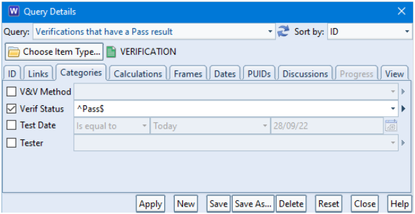
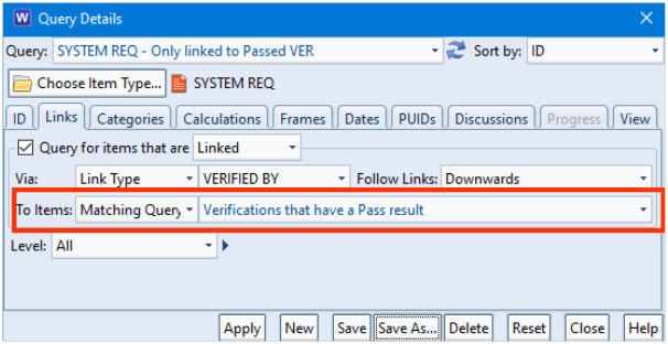
Query and Report Data
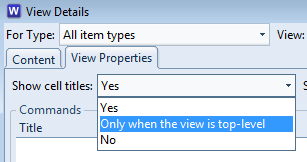
Cradle provides uniquely powerful data query and visualisation facilities. Each user’s environment can be tailored by defining custom queries, views, forms, navigations, matrices, reports and other facilities. All customisations have a scope, to be specific to the end user, or shared with other users of the same type (such as all customers or all managers), the user’s team, the entire project, or all projects.
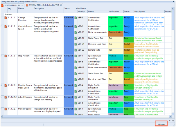
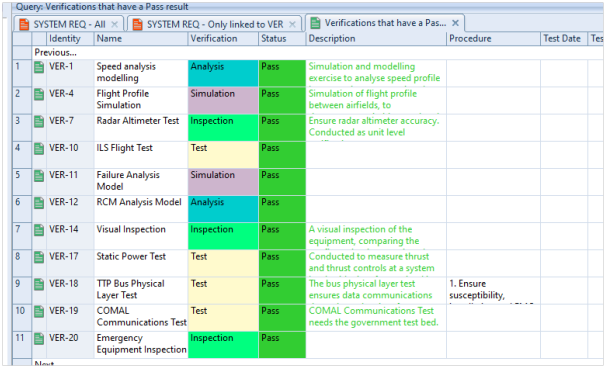
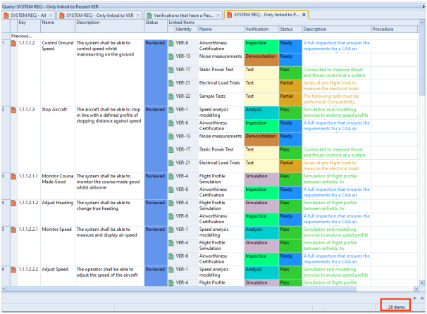
Any desired compliance, coverage or traceability report can be created quickly/easily using Cradle’s queries, multi-row views/nested table view, and saved for later use.
Licensing
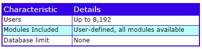
Cradle has floating, dynamic licensing and low cost read-only users. Open and named user licences are available. Everything described here is free of charge.
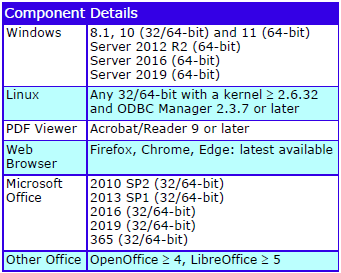
Licences, databases and schemas are interchangeable across Linux and Windows 8.1, 10, 11, Server 2012 R2, 2016 and 2019.
Optional support for Oracle and MySQL.
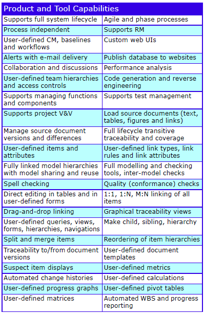
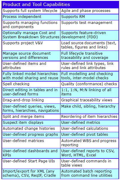
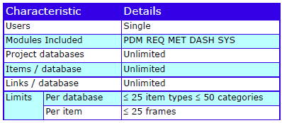
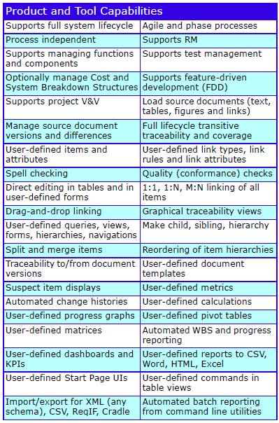
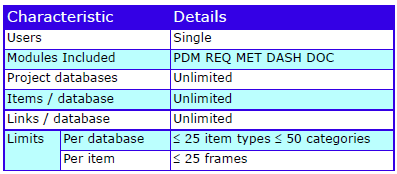
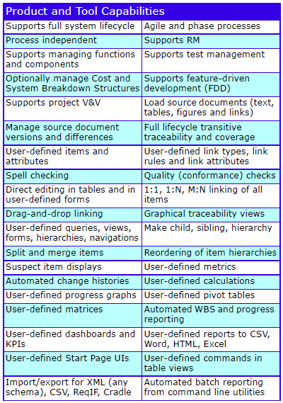
Feature Summary
Please contact 3SL for further information about Cradle PDM licences.