You can find items in a Cradle database by running a query. For example, you can use the pre-defined queries in the Quick Access Bar at the bottom of the UI. Once the query has run, the results are shown in a display style. Tree style is one of the four styles available:
- List style
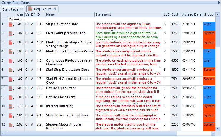
- Table style
- Document style
- Tree style
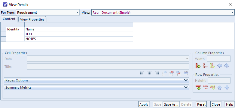
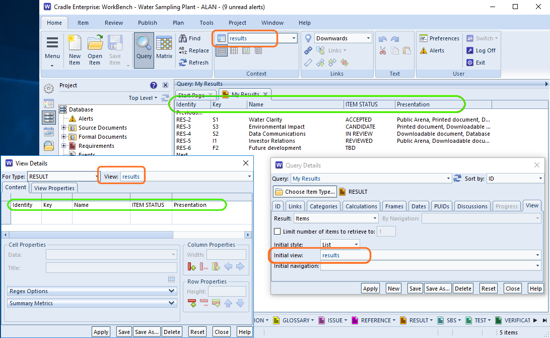
A view is used to specify which parts (attributes) of the items will be shown. A display style controls how these attributes will be displayed, and the facilities that are available to you.
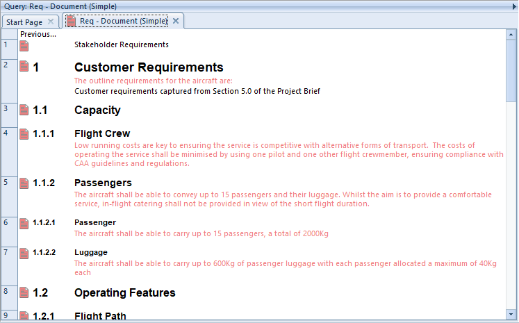
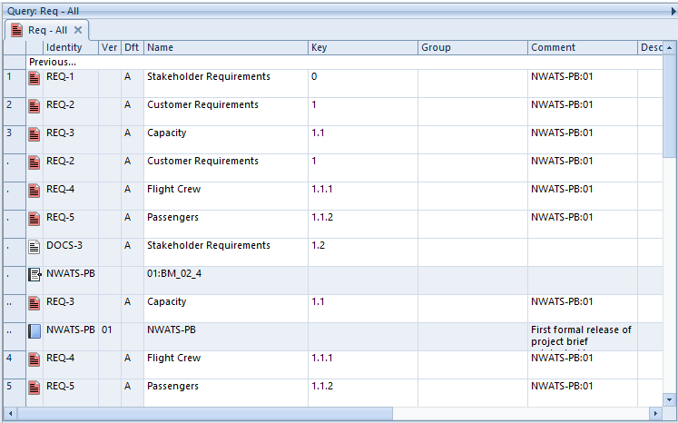
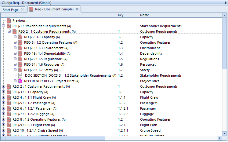
Tree Style
This is the second most frequently-used of the display styles after table style. It displays each item as a node in a tree, with a set of columns for the other attributes:
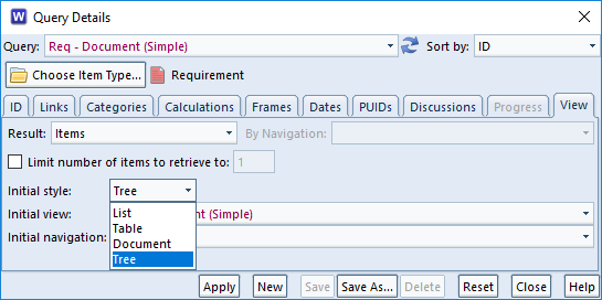
There are two views used to display trees:
- A view that specifies the contents of the node shown in the tree. You specify this view in the schema for the item type.
- A view that specifies the attributes shown in columns to the right of the tree
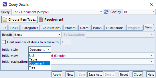
To have items displayed in this style:
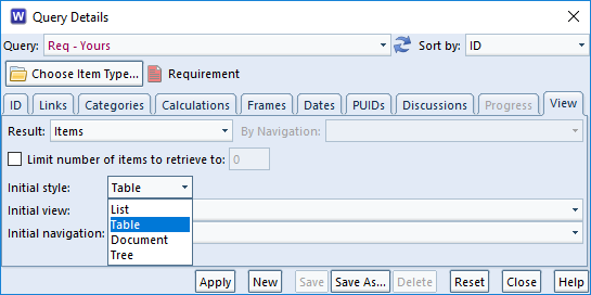
- Specify it in the query to be run:
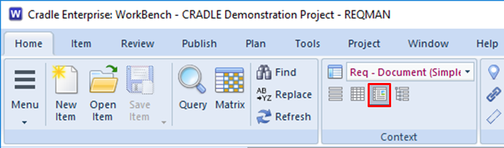
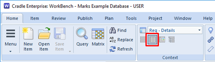
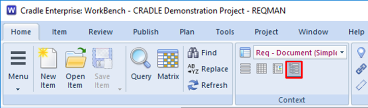
- Also, select it from the Context group in the Home tab:
- Or, right click and choose Style -> Tree from the context-sensitive menu
- Finally, press <CTRL> and 4
Facilities
- Use the left mouse button to select individual items
- You can select a groups of items by selecting the first and then pressing <SHIFT> and the left mouse button to select the end of the group
- Press <CTRL> and the left mouse button to select or de-select individual items
- You can shrink and widen the display columns. Move your cursor to the edge of a column heading and the cursor will become a pair of arrows. Press, drag and release the left mouse button to change the column’s width.
- You can follow cross references by expanding the tree node for the item. Cradle will find all cross references to and from the item, select which cross references to use, and display the items at the other end of these cross references as new nodes in the tree.
- Use drag-and-drop items between trees to create cross references between the items
- Drag-and-drop items inside a hierarchy of the same type of items to reorder that hierarchy and automatically rebuild the hierarchical numbering within it
You can expand a tree node by:
- Click its + button
- Select the text of the tree node and press: +
- Select the text of the tree node, right click, and choose Expand from the menu
- Double click on the text of the tree node
You can collapse a tree node by:
- Click its – button
- Double-click on the text of the tree node
- Select the text of the tree node and press: –
- Select the text of the tree node, right click, and choose Collapse from the menu
Advantages
The advantages of tree style are that it is:
- The simplest way to explore items and their relationships
- A convenient method to create cross references
- The easiest way to reorganise a hierarchy of items
If you want to do anything with cross references between items, or to work in a hierarchy of items, then this is the best display style to use.
Disadvantages
The disadvantages of tree style are that:
- It provides a limited ability to display information
- You cannot edit information directly
Summary
Tree style is the most convenient method to work with cross references within a set of items and between one set of items and other sets of information.
Therefore, we recommend this style whenever you need to work with cross references between items and inside hierarchies.