Diagram Preferences

Drawing Just the Way You Like It

We all have our preferred way of doing things. Whether that’s a corporate or a personal view. 3SL don’t enforce a particular layout style, colour or size. These diagram preferences can be set by the user. As with any preferences, they can be set at an installation level in the cradle.ini file on Windows® or .cradlerc file on Linux® file as a default or overridden by the user.

Grid Preferences

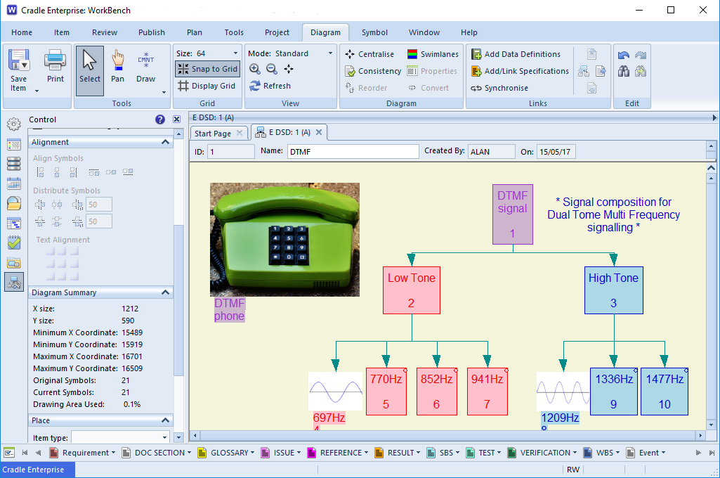
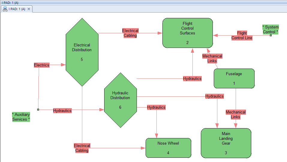
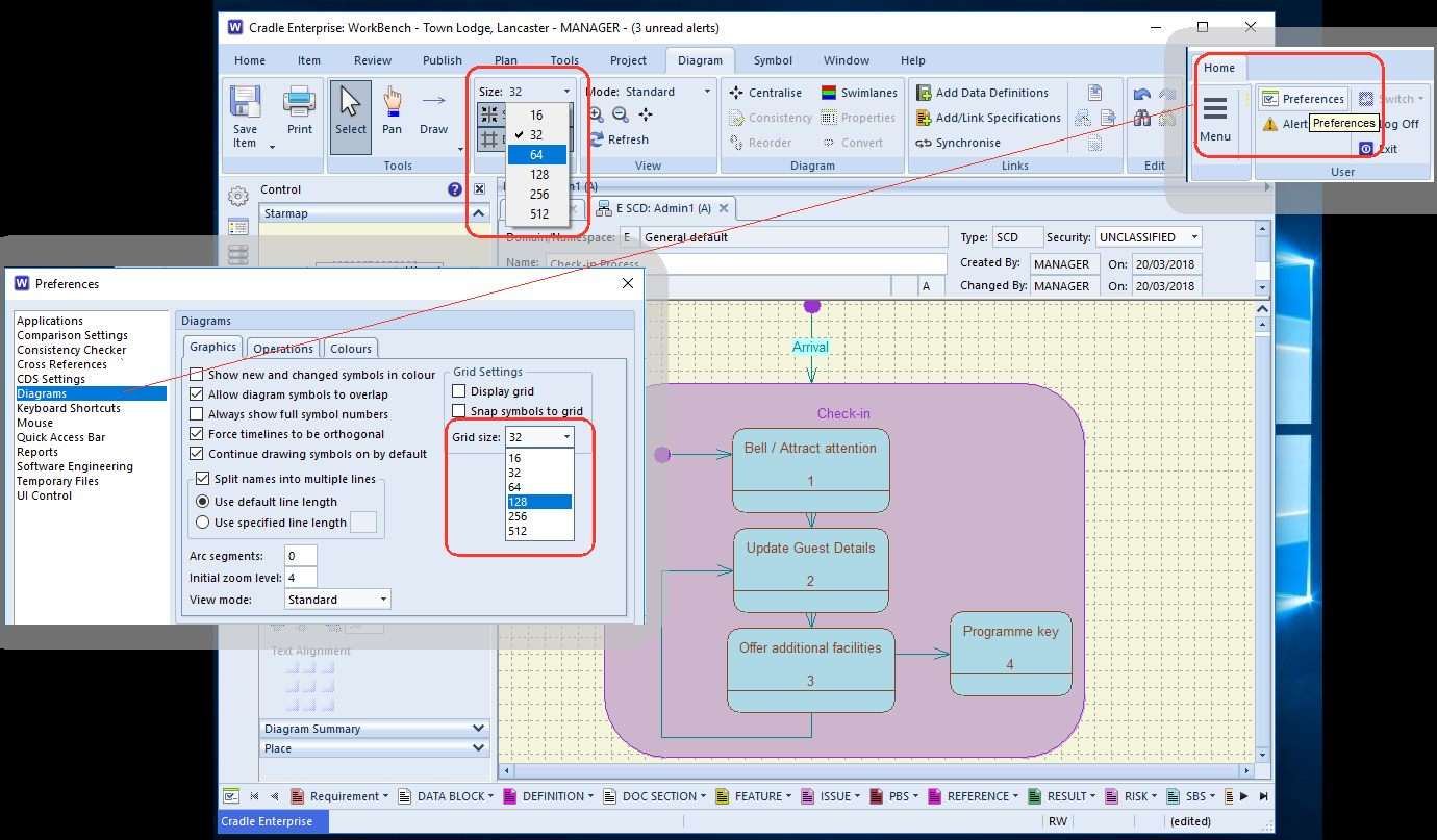
In the diagram below  it can be seen that the drawing grid is quite small (32). Which is great for finer detail. However, if you are mainly concerned with large blocks in your diagrams and want plenty of space, a layout guide of 128 may be more appropriate. Users have two options, firstly to set the size each time they use Cradle from the Grid section on the Diagram  tool-bar or to set their drawing preferences.

setting the grid preferences for diagram drawing in Cradle
Diagram Preferences

Preference Dialog

The dialog can be opened from the Preferences option on the Home tool-bar. Once the dialog is displayed, the diagram preferences are set using the the Diagrams section. There are a number of defaults that can now be set ranging from the initial grid size to whether specifications are automatically created when the diagram is saved.  You can change the palette too, so a mute background rather than bright white can be chosen to be easier on the eye.


Celebrate World Telecommunications Day 2017

The aim of World Telecommunications Day is to highlight the importance of communication and how information travels across the world.

The day is closely  connected with the International Telegraph Union (ITU), the committee formed in 1865 to handle the emerging technologies.

We’re celebrating Dual-Tone Multi-Frequency signalling (DTMF). This is in-band signal alongside the normal voice data, between equipment and other devices and usually at the exchange. DTMF was first developed in the Bell System.

Data Structure Diagram illustrating DTMF
DSD showing DTMF signalling tone

Data Structure Diagram (DSD)

DSDs are a graphical alternative to the composition specifications in data definitions. In our model of the DTMF, the signal is shown comprising of the Low Tone and the High Tone. These are  made up of the individual optional low and high tone components.

If you want a teaser for World Telecommunications Day 2017, why is the 1633Hz frequency not shown?

Answer below:


Continue reading “Celebrate World Telecommunications Day 2017”

Single Diagram Consistency Check

Want to run a Consistency Check on just a single diagram?

Consistency Check from the Project Sidebar

If the user doesn’t wish to open the diagram, to run a consistency check. They can just right-click on a diagram in the Project sidebar tree and select ‘More –> Consistency Check’ from the context menu.

Consistency Checking a diagram from Project Tree
Using the Consistency Checker for a single diagram

This will bring up a report on the errors and warnings within the diagram; it will not open the diagram:

Physical Architecture Diagram Consistency Check Report
PAD Consistency Check Report

Check Diagram within a Form

If the user is happy to open the diagram in a form, they can right-click on the diagram and select ‘More –> Consistency Check’ from the context menu. They can also select the Diagram tab and click on the Consistency button.

How to Consistency Checker a single diagram in a form
Single Diagram Consistency Checking from a diagram form

Once the check is done the diagram will show you with the colours red (item has an error) and green (item is fine) in the diagram. A report with the errors within the diagram will now open as well.

Physical Architecture diagram showing the errors in red
Physical Architecture diagram showing the errors

Once you have checked and corrected the errors found, you can then recheck the diagram if you so wish.

Complete Consistency Check of a single diagram in a form

Once the diagram is error free, it will show all symbols as green and the report will not show any errors.

Click for more information on the Consistency Checker

Symbol Colours and Defaults

Control by Preferences or Per Symbol

Tired of having to change the colour of each symbol everytime you create one?

Well, it is possible to set the default colours for Cradle drawing symbols in the user preferences dialog. This can be over-ridden on a symbol by symbol basis using the colour palette or a colour set.

Below is a screenshot of where you can set symbol colours from preferences. Inside the symbol dialog along the menu ribbon. You can also select ‘Set colours’ which would change the colour of that symbol without having to go into preferences, making your life easier.

Symbol colour settings
Set Symbol Colours

This enables you to completely customize your diagrams with as much or as little colour as possible. Using colour to co-ordindate your projects.

Article updated 05/12/2018 – Added an inroduction and conclusion

More Drawing Area

Need more space to see your diagram?

Closing the sidebar and the ‘Diagram Form Item details’ can leave more drawing area on your screen. Double clicking the ribbon will close this up too. Clicking the sidebar icons opens the sidebar once again or the ribbon title opens the ribbon. Performing all these actions will increase the drawing area to the maximum.

how to get More Drawing Area
More Drawing Area

Which Symbol?

Model Based Systems Engineering Drawings

Model-based Systems Engineering represents systems engineering components in domains, gathering together the data and functions in a formalised manner. This helps with the exchange of data between different disciplines, stakeholders and customers within a common frame work. Element details are often represented as a symbol on a diagram.

A common systems modelling technique, for say the functional aspects, would be to show them in a multi-tier, time-sequenced, step-by-step flow diagram or eFFBD. The diagrammatic format makes it much easier to assimilate the whole concept.

Whilst our help offers good coverage of the modelling capabilities in Cradle. We understand getting to grips with the details of the tool can be complex. When you are working with a new diagram type for the first time, some of the symbols can look very similar. The palette on in the sidebar shows tootips, but hovering over each is not very efficient. If you are confused about which symbol is which, select ‘Draw‘ button from Tools ribbon. You will then see the name of each symbol alongside its icon.

Selecting different symbols
Diagram Drawing Palette
Article Updated 16/05/2018