Traditional KPIs in a Dashboard
Cradle has supported KPIs being shown in the sidebar of WorkBench or Web Access for a number of years. This gives a quick overview of the health of the project. It’s giving a rating for each of the measurements and coloured highlighting to draw attention to those areas that need further input.
Due to its compactness, this table style allows many KPIs to be shown in a small space. However, one of the limitations with this approach is that the scale of the measurement and the relative position of the current value are not immediately obvious.
Bring on the Dials
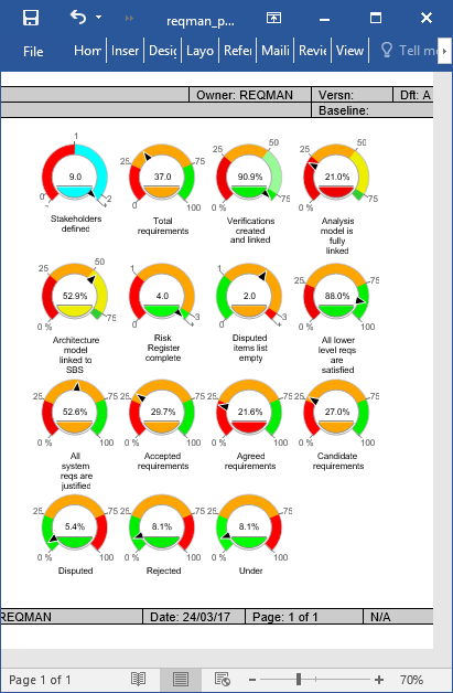
A dial on the other-hand can display the full range, and the relative position. This allows a much faster assimilation of the data being shown to the user.
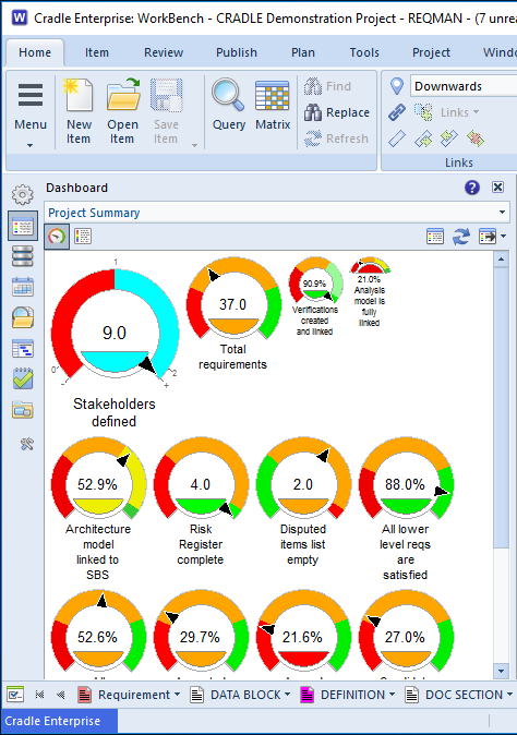
New Cradle 7.2 Dashboard Dials Feature
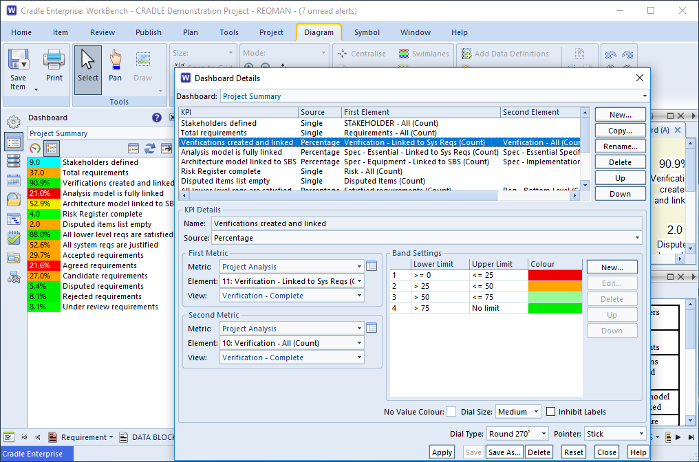
Cradle’s dashboard dials are available in a number of sizes, thus allowing more important dials to be clearly seen. The size is set per dial as:
- Large
- Medium
- Small
- Minimal
There are also a number of styles available for the dashboard as a whole:
- Round 270°
- Round 180°
- Round 140°
- Text
These can be displayed with the following pointer types:
- None
- Triangle
- Stick
- Needle
- Coloured
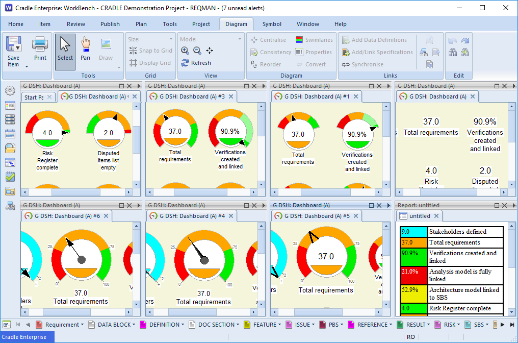
It’s also possible to print these dials to the standard Cradle outputs:
- SVG (for display in a browser),
- RTF (for display in Microsoft® Word and similar),
- PostScript®
- PowerPoint®
- EPS
- FrameMaker®
- HPGL