Regionalisation

Message Catalogue Manager

You will undoubtedly know that Cradle UIs are supplied in a number of different languages. This internationalisation is driven by our customer base and distributors. However, because a language may spoken in many parts of the world we offer localisation of our message catalogues. But did you know that you can also support regionalisation of your catalogue?

Message catalogues are split into three levels, Language (ISO 639), Country (ISO 3166) and Region.

The more frequent variants would be:

  • en = A base language English Catalogue
  • en_GB = The Queen’s English variant
  • en_US = A variant for over the pond.

or

  • fr = French language catalogue
  • fr_CA = Canadian variant likely to be used in Quebec, or Eastern Ontario

But you can get more specific

  • en_GB_cumb = A variant covering the Cumbrian dialect

Whilst my choice of a Cumbrian dialect regionalisation is unlikely to have a  practical use, we do recognise that some terms may be better understood in some areas of the world, than others. These stages could be used to create any language or variant you wish.

Showing the steps used to produce a language variant
Message Catalogue Manager Steps
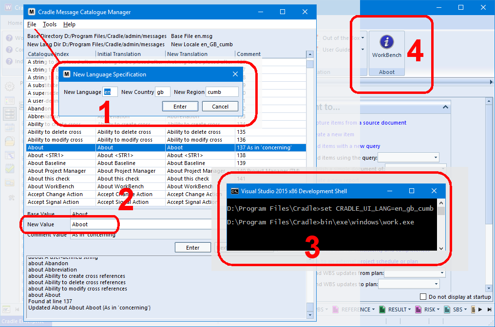
  1. Open the base language catalogue, in this case en, then Create New Language country gb and region cumb
  2. Alter only the words that differ from the base catalogue in the country / regional variant and save the file
  3. Ensure your environment language or the CRADLE_UI_LANG environment variable is set for the new language
  4. Open up a Cradle tool such as WorkBench and check the word has been replaced

There is also an XLIFF export and import function in the Tools section that allows the new catalogue to be sent for external translations.

For full details of how to create languages, see the help for Message Catalogue Manager

Now it’s over to you why not try a regionalisation in Cradle in Klingon en_us_klingon?


Article Updated: 31/05/2018 – XLIFF

Customise your Quick Access Bar to your needs

Quick Access Bar

The Quick Access Bar (QAB) is intended to provide quick and easy access to all of the types of information in your Cradle database that are relevant to you. It provides easy access to the Automatic scope queries for all item types as a scrollable list of controls, each of which provide access to an automatic menu for an item type.

Controllability

But what about if you only want the bar to display a specific set of item types or you want them in a specific order?

You can customise how the QAB will look for you in User Preferences. Choose which items are to be shown and in which order you wish them to be displayed you even have the option to set whether you want the Quick Access Bar to be shown when WorkBench starts.

Quick Acces Bar in User Preferences
Customising your Quick Access Bar

For further information on customising your UI see this previous blog post.

Related Article:

If you need to set these values for everyone in the project, it can be achieved with the Cradle initialisation file.


UPDATED: April 2020 – Related article

WorkBench Screen Panes and Tabs

UI Layout

The Cradle WorkBench UI screen is divided into panes, tabs. Tabs can hold a variety of data, items in forms, queries as views, diagrams and so on. When you subsequently create more data (say opening an item from the project sidebar) WorkBench will heuristically attempt to find the most appropriate pane to place the item in. For example if there is a query in one pane and an item in another, opening another item should place it with the other item.

Panes

The main sub division of the screen is a pane. Each pane is a region that can contain one or more tabs.

Tabs

Each pane is a region that can contain one or more tabs. A tab is a container with a selectable name and a rectangular area that contains the results of running a query, report, metric or graph, or a single item that is being edited.

Tabs behind Tabs?

If you’ve run a couple of queries and opened a couple of items they will each be in a separate tab. Arranging the screen panes and tabs is the answer. If you want to see those tabs side by side you can split the screen horizontally or vertically to arrange the screen panes.  You can then drag and drop the tabs into these new panes.

Menu showing how to split a pane top and bottom
Split Pane Top / Bottom

There are other UI (User Interface ) commands that allow you to Maximize and Restore the tab from the same menu.

Sessions

Select a session upon login
Sessions option in Login dialog

You can design your Cradle UI with a set of panes grouped in nested rows and columns in your preferred layout. This layout is called a session. Using sessions is the easiest way to maximise your productivity with Cradle.

Article Updated 17-23/07/2018 – Working with panes, Working With Tabs, Using Sessions

Multiple Data Cells – Preserve Line Breaks

Lots of Data in a Small Space

The purpose of Multiple Data Cells in a view is to allow more data to be consolidated in one place. It might me that a reference number is made up from categories storing ‘Part‘, ‘Sub-Part‘ and ‘Version‘. This may need to be formatted in a cell as part:sub-part/version. This can be achieved by setting the format of a multiple data cell in the Cradle view.

This image shows the TEST STATUS:TEST TYPE and Text from the test being combined in one cell.

Showing the difference between preserved and non preserved line breaks
Multiple Cell – Preserve Line Breaks

New Cradle-7.2 View Feature

Initially the cell string was formed by combining the text from single line entries from categories, the group, description and possibly piece of text from a frame. Customers have found the multiple data cell useful and have been combining data from frames with multiple lines.  Whilst the drive is still to show as much data in a combined block, those using, say lists as in the example shown, found that the removal of line breaks in the display altered what was being conveyed. It is now, therefore, possible to select the ‘Preserve line breaks’ option in the ‘Multiple Data Cell Setup’, ‘Edit Attribute’ dialog.

Specific Colours

Need to be Precise About Colour?

If you have a specific colour, say a corporate identity, you may need to reproduce this colour in as many of your tools and their outputs as possible.

Cradle has a default shipped palette 120 colours. But these may not precisely match your requirements.

Solution

You can tweak the Cradle colours.txt file to change the RGB values to match your colour ident. This colour will now be available in the palette.

So if you need to produce #ColoroftheYear2017 Pantone®’s  15-0343 Greenery if you choose the nearest RGB values, you can.

Editing the colours.txt file to produce a precise colour
Cradle colours.txt file

Continue reading “Specific Colours”

‘Basic’ Web Access UI

New Cradle 7.2 Web Access Feature

We now ship a ‘Basic’ Web Access user interface is  now shipped (in the Program Files\Cradle\www\pdb\demo folder). The simple uncluttered format helps by guiding users to operations akin to the WorkBench start page.

Sometimes new  or infrequent users are outfaced by a complex UI, especially when they don’t need all the features presented. The new ‘basic UI’  is designed to highlight common tasks making it easier for new users to get straight to their area of work.

The provided demo UI will give basic functionality. Also in the folder are a few examples of customised forms and views, which can be used as a starting point for your own projects.

Showing selection of the 'Basic' Web Access UI
‘Basic’ Web UI for Web Access

Cradle User Interface Languages

What ever your language…..

Cradle is currently available in available in eight  English/ English US, Chinese(zh), Dutch(nl),  German(de), French(fr), Korean(ko), Russian(ru) and Welsh(cy), languages.

WorkBench yn Gymraeg
Welsh UI for Cradle WorkBench

If there is a UI (User Interface) language you would like, please speak to us and we will quote for other translations.  Alternatively you can add your own Language, Country or Regional variant. Use the supplied Message Catalogue Manager software tool in Cradle.

Making Space – Maximized Data Display Area

I Need More Space

There is a lot of information in the WorkBench UI (User Interface). Sometimes you want a concentrate on one aspect, and it many not be possible to see everything you want in one go. You may be using Cradle on a laptop or tablet with a small screen and a limited display resolution. If so, you may want a maximised data display area, by reducing the screen area occupied by the Cradle UI controls. Make space in Cradle’s WorkBench interface by closing sidebars and the ribbon, status bar and Quick Access Bar (QAB).

Maximised Data Display Area

You can do several things to maximise what you can see in the WorkBench UI. In general, these are all to minimise or hide parts of the WorkBench UI. You can make many of these changes permanent by setting your preferences. To set yourpreferences, select Preferences in the Home tab, make the changes (typically in the UI Control group) and finally, click OK.

set UI preferences in 3SL Cradle RM SE Tool
Setting UI Preferences

Hide the Sidebar

You can hide the sidebar on the left of the UI by clicking whichever sidebar’s button is currently selected. This will make the sidebar disappear.

You can prevent a sidebar being shown when WorkBench starts by setting the Default sidebar user preference to None:

maximised data display area in 3SL Cradle RM SE Tool
Set No Sidebar

Hide the Quick Access Bar

The Quick Access Bar is a horizontal menu of buttons that provides easy access to sets of queries that Cradle creates automatically when you define item types in your database schema.

You can hide the quick access bar from the Window group in the ribbon:

maximised data display area in 3SL Cradle RM SE Tool
Hide the Quick Access Bar

You can prevent the quick access bar being shown when WorkBench starts by de-selecting the preference Show quick access bar when WorkBench starts:

maximised data display area in 3SL Cradle RM SE Tool
Set No Quick Access Bar

Hide the Status Bar

The Status Bar is a horizontal collection of status indicators shown across the bottom of the UI. You can hide the status bar from the Window group in the ribbon:

maximised data display area in 3SL Cradle RM SE Tool
Hide the Status Bar

Minimise the Ribbon

You can minimise the ribbon across the top of the UI by double-clicking to the right of the tabs, typically to the right of the Help tab.

Maximise Diagram Area

When you edit or view a diagram in any model, Cradle will display it in a form. This form includes the diagram’s symbols in a drawing area. It also includes other diagram attributes. You can set the preference so that you only see the diagram’s symbols when a diagram is first drawn:

maximised data display area in 3SL Cradle RM SE Tool
Hide Diagram Attributes

Press A to toggle the display of the other diagram attributes.

Normal Display Area

For illustration, a typical WorkBench UI showing a query with a simple view in Table style would appear like this:

maximised data display area in 3SL Cradle RM SE Tool
Normal Data Display Area

Maximium Display Area

If you use all of the tips described here, the UI will have a maximised data display area and will appear like this:

maximised data display area in 3SL Cradle RM SE Tool
Maximised Data Display Area

This is a useful increase in the screen area used to display information.


Article Updated: More details 26/07/2018

Symbol Colours and Defaults

Control by Preferences or Per Symbol

Tired of having to change the colour of each symbol everytime you create one?

Well, it is possible to set the default colours for Cradle drawing symbols in the user preferences dialog. This can be over-ridden on a symbol by symbol basis using the colour palette or a colour set.

Below is a screenshot of where you can set symbol colours from preferences. Inside the symbol dialog along the menu ribbon. You can also select ‘Set colours’ which would change the colour of that symbol without having to go into preferences, making your life easier.

Symbol colour settings
Set Symbol Colours

This enables you to completely customize your diagrams with as much or as little colour as possible. Using colour to co-ordindate your projects.

Article updated 05/12/2018 – Added an inroduction and conclusion

More Drawing Area

Need more space to see your diagram?

Closing the sidebar and the ‘Diagram Form Item details’ can leave more drawing area on your screen. Double clicking the ribbon will close this up too. Clicking the sidebar icons opens the sidebar once again or the ribbon title opens the ribbon. Performing all these actions will increase the drawing area to the maximum.

how to get More Drawing Area
More Drawing Area